Parks Tacoma Brand Identity
The Parks Tacoma rebrand was created to present the organization more clearly and consistently to the community. Research showed that while people felt positively, many did not realize the full range of places and programs on offer, and the use of multiple visual identities added to the confusion. The name was simplified from Metro Parks Tacoma to Parks Tacoma because it is simple, intuitive, and rooted in what people value most. At the heart of the new identity is the Salal leaf, an evergreen native to the Pacific Northwest that has long provided food, medicine, and beauty to local tribes. Its resilience and adaptability make it a symbol of everyday nourishment, play, and connection to nature across all neighborhoods.
Client
Parks Tacoma
Year
2025

PRIMARY LOGO
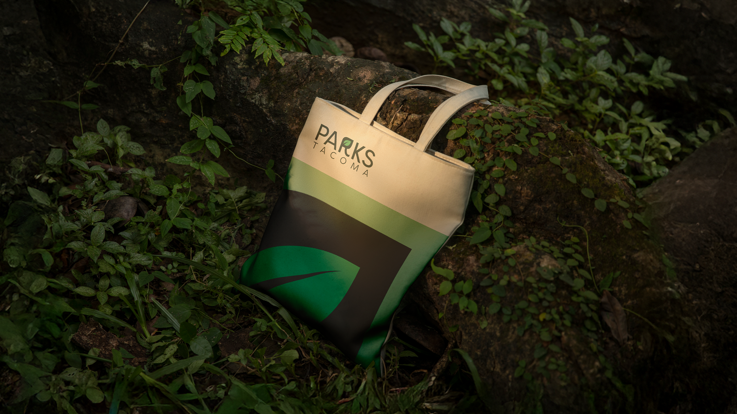
The Parks Tacoma logo is the sole mark of the brand, centered on the Salal leaf as a symbol of resilience, growth, and connection to the region’s ecology. It represents the full range of parks, programs, and community spaces, ensuring a consistent and recognizable identity across all applications.


COLOR PALETTE
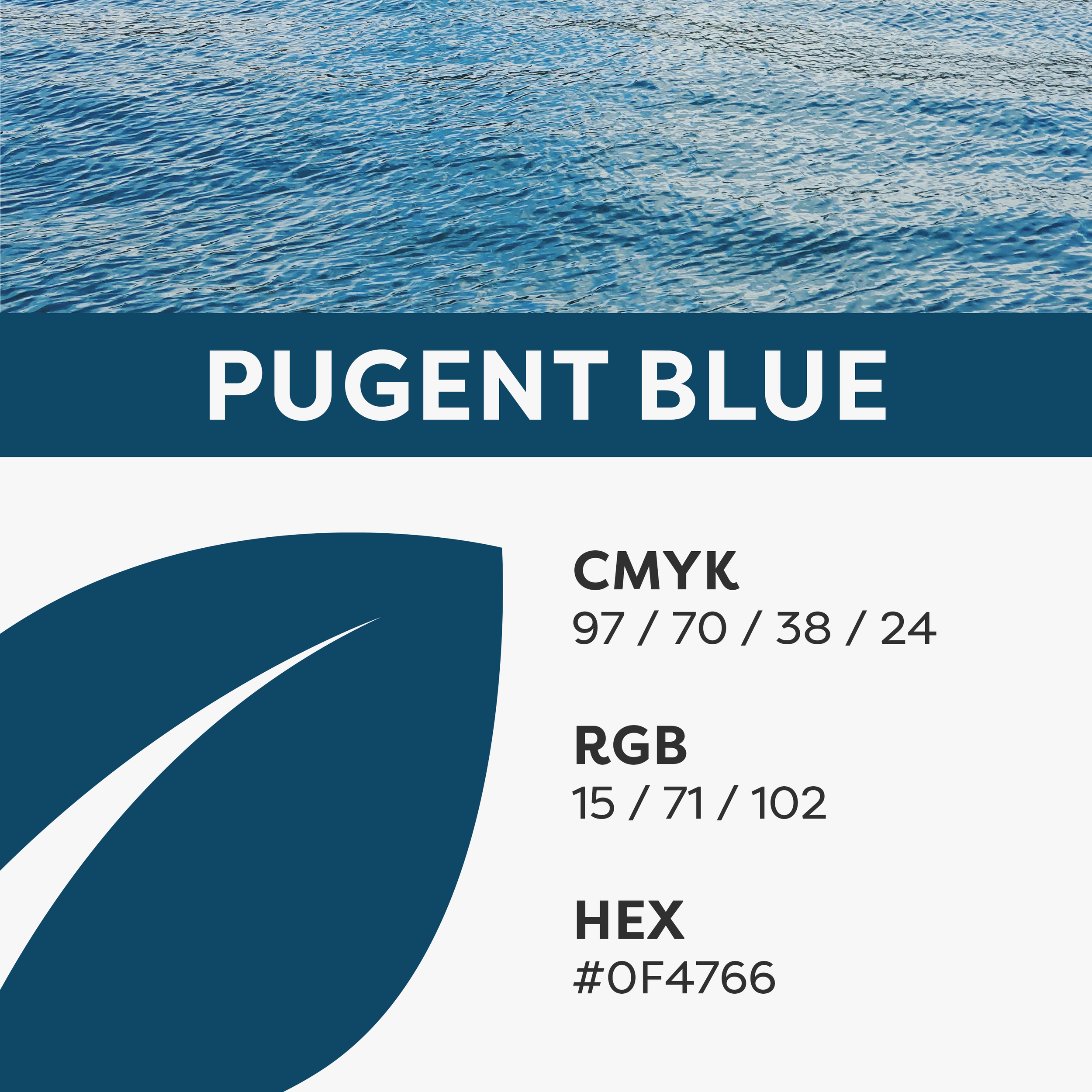
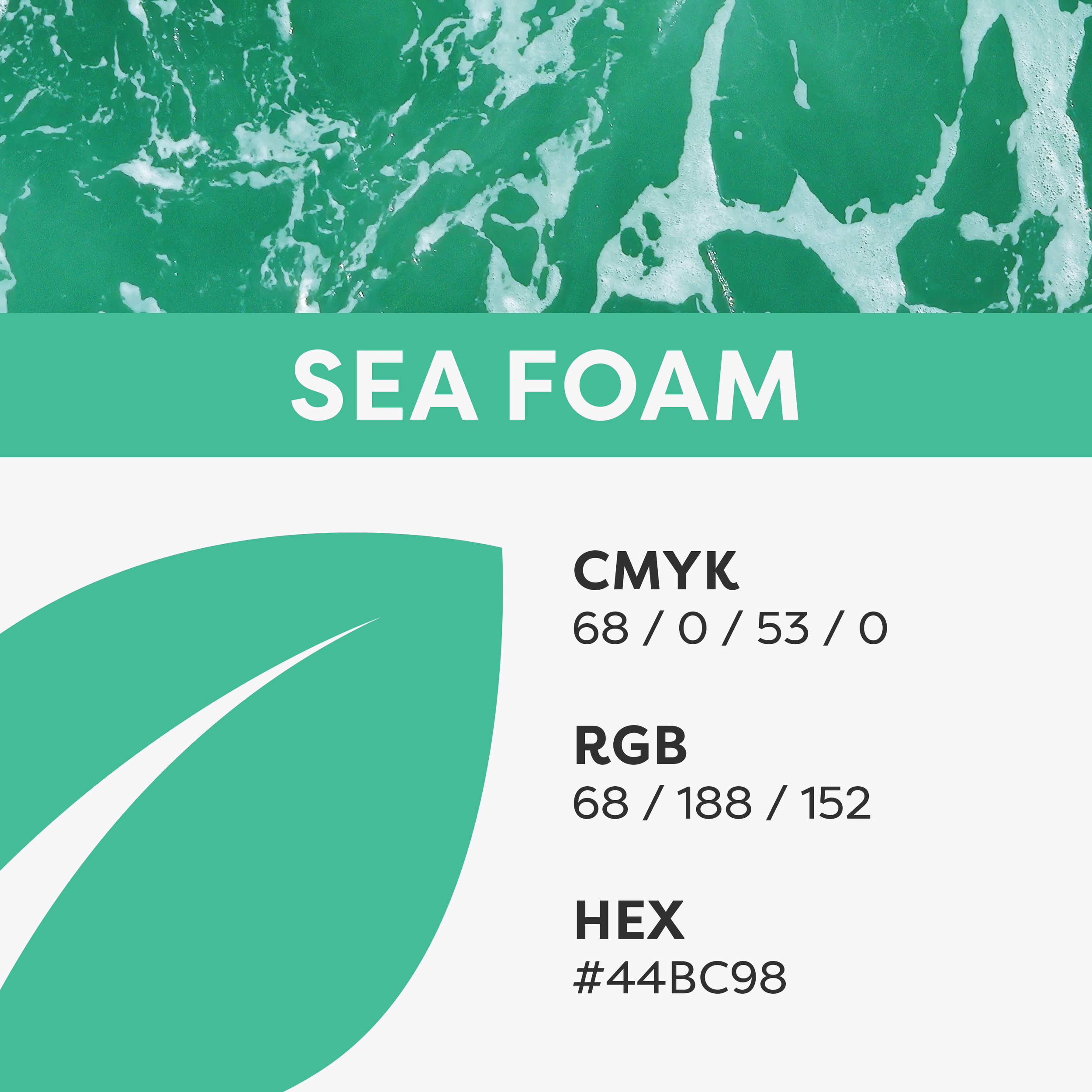
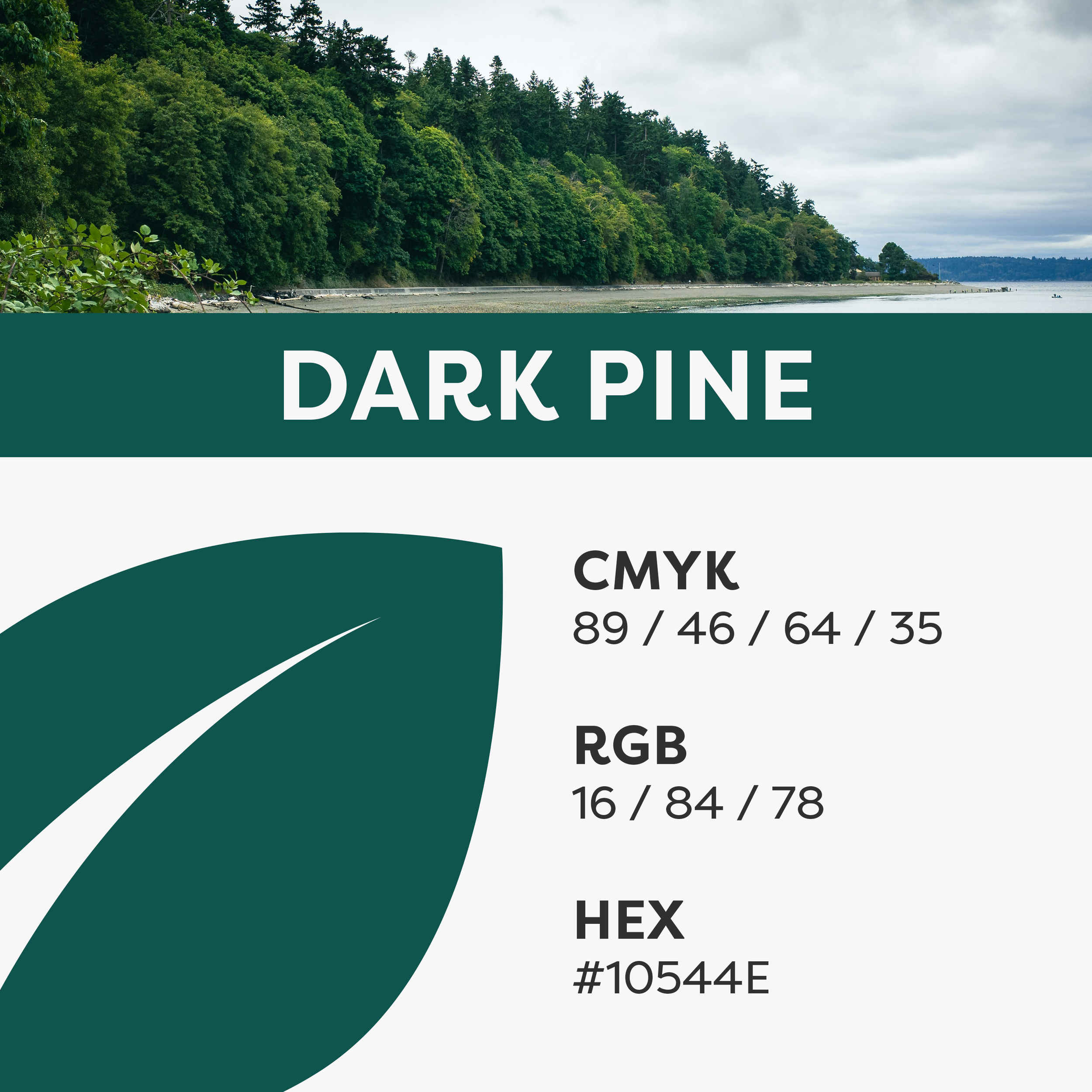
The Elements of Tacoma palette is inspired by the natural environment of the region. With primary colors from the water and shoreline and secondary colors from the earth, forests, and light, it reflects the full range of experiences Parks Tacoma offers.


